The City Connect Jersey: Expert Analysis
When a leaked picture of the Toronto Blue Jays’ City Connect jersey made the rounds on social media, it sparked a wave of reactions from fans, with many expressing their disappointment. However, one individual who held a different perspective was Chris Creamer, a renowned expert in team branding and founder of Sportslogos.net. Creamer’s positive outlook on the jersey design sheds light on its unique qualities and significance within the realm of sports apparel.
The Concept of City Connect Jerseys
City Connect jerseys were introduced by MLB and Nike in 2021 as a way for teams to showcase alternate uniforms that pay tribute to the culture and community of their respective cities. With each design aiming to appeal to a wider audience beyond traditional fans, the Blue Jays’ unveiling of their City Connect uniform was a highly anticipated event. Creamer highlighted the goal of these jerseys in garnering attention for the league and noted the mixed reception they have received thus far.
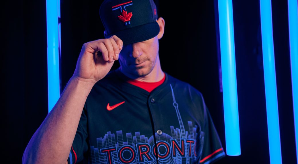
Breaking Down the Blue Jays’ Design
The Blue Jays’ City Connect jersey incorporates a blend of red, blue, and black, drawing on the team’s history and iconic past players. Creamer commended the inclusion of team colors and branding in the design, emphasizing the significance of the word ‘Toronto’ against the backdrop of the city’s skyline. While the unconventional use of a skyline on a baseball jersey may raise eyebrows, Creamer lauded the overall design of the uniform, noting its departure from the norm in a positive light.
What’s Missing?
Despite the jersey’s nods to the Blue Jays’ legacy, Creamer pointed out a missed opportunity in acknowledging the city’s baseball history, particularly the Toronto Maple Leafs of the Intercounty Baseball League. He expressed a desire to see greater recognition of this important aspect of Toronto’s sports heritage within the uniform design.
Fan Reaction
As expected, the leaked image of the Blue Jays’ City Connect jersey elicited a negative response from fans, a common trend following uniform unveilings across the league. Creamer highlighted the inevitability of dissenting opinions when it comes to jersey designs, noting that comfort and tradition often dictate fans’ preferences. However, he commended the Blue Jays for taking a bold step with their design and encouraged fans to embrace innovation and change in sports apparel.
In conclusion, the analysis provided by Chris Creamer offers a unique perspective on the unveiling of the Toronto Blue Jays’ City Connect jersey, shedding light on the intricacies of uniform design, fan reactions, and the broader impact of such initiatives in the world of baseball.
Image/Photo credit: source url